I Have All The Data But I Don’t Understand

By recognizing the differences and prioritizing insights and root causes, leaders can enhance their understanding of daily operations. Embracing strategies such as gemba walks, collaboration, data analytics, continuous learning, and mentoring relationships empowers leaders to unlock hidden potential and drive transformative change.

In the fast-paced world of manufacturing, production leaders face a constant influx of data. However, simply acquiring data is not enough to drive operational excellence. To make informed decisions and identify root causes, leaders must strive for a deep understanding of daily operations. In this blog post, we will explore the critical differences between data acquisition and true understanding. Additionally, we will provide practical strategies for manufacturing leaders to enhance their comprehension of daily operations.

1. Overwhelming Data: A Barrier to Effective Processing

In today’s manufacturing landscape, we are inundated with more data than we can effectively process. The sheer volume of information can overwhelm leaders, making it challenging to extract meaningful insights. Leaders must recognize that data alone does not equate to understanding. Instead, it serves as a foundation for deeper analysis and interpretation.

2. Grasping the Root Cause: The Key to Operational Constraint

To overcome operational challenges, leaders must fully understand the problems they encounter. Superficial knowledge of symptoms or surface-level analysis is insufficient. True understanding requires delving into the root cause and uncovering the underlying factors that contribute to constraints or inefficiencies. By addressing the root cause, leaders can implement targeted solutions and drive sustainable improvements.

3. Data vs. Understanding: Bridging the Gap

Recognizing the distinction between acquiring data and reaching a comprehensive understanding is crucial. Mere data acquisition involves collecting information without necessarily gaining insights. True understanding, on the other hand, involves analyzing data, recognizing patterns, and contextualizing the information. It is a cognitive process that leads to meaningful comprehension and informed decision-making.

4. Differentiating Data Acquisition from Understanding

To shed light on the disparities between data acquisition and understanding, let’s explore the key differences:

  • Depth of Analysis: Data acquisition involves collecting information at a surface level, while understanding requires diving deeper, analyzing patterns, and uncovering insights.
  • Contextual Understanding: Data acquisition may provide isolated facts, whereas understanding involves comprehending the context, interrelationships, and broader implications.
  • Interpretation and Synthesis: Understanding necessitates interpretation, synthesis, and connecting the dots between data points, enabling leaders to derive comprehensive insights.
  • Application and Problem-Solving: Data acquisition lacks the ability to apply knowledge to practical situations while understanding empowers leaders to address complex problems effectively.
  • Decision-Making: Understanding enables leaders to make informed decisions by considering various factors, weighing consequences, and assessing the long-term impact.

5. Strategies for Improving Operational Understanding

Manufacturing leaders can enhance their understanding of daily operations by implementing the following strategies:

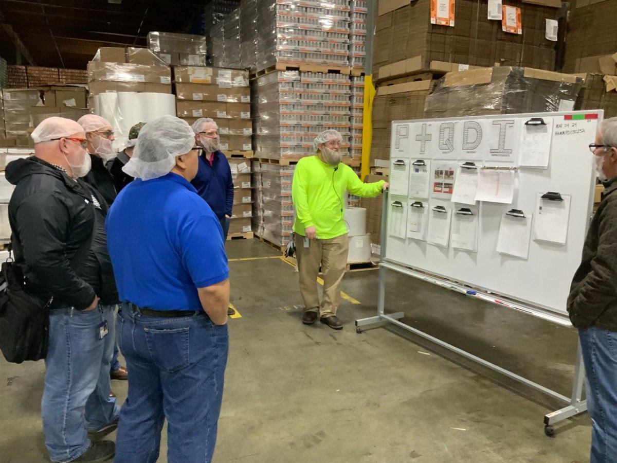
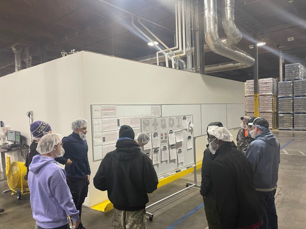
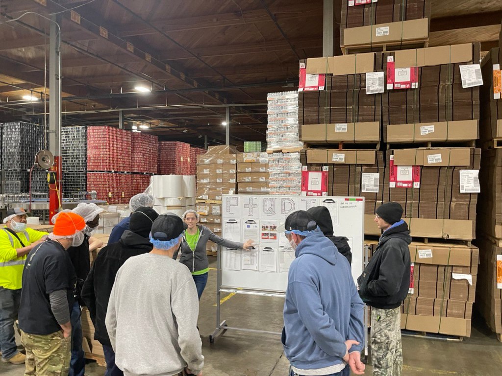
  • Embrace Gemba Walks: Engage in regular visits to the shop floor to observe operations firsthand, ask questions, and gain a deeper understanding of processes and challenges.
  • Foster Cross-Functional Collaboration: Encourage collaboration between different departments and teams to gain a holistic view of operations, leverage diverse perspectives, and foster knowledge sharing.
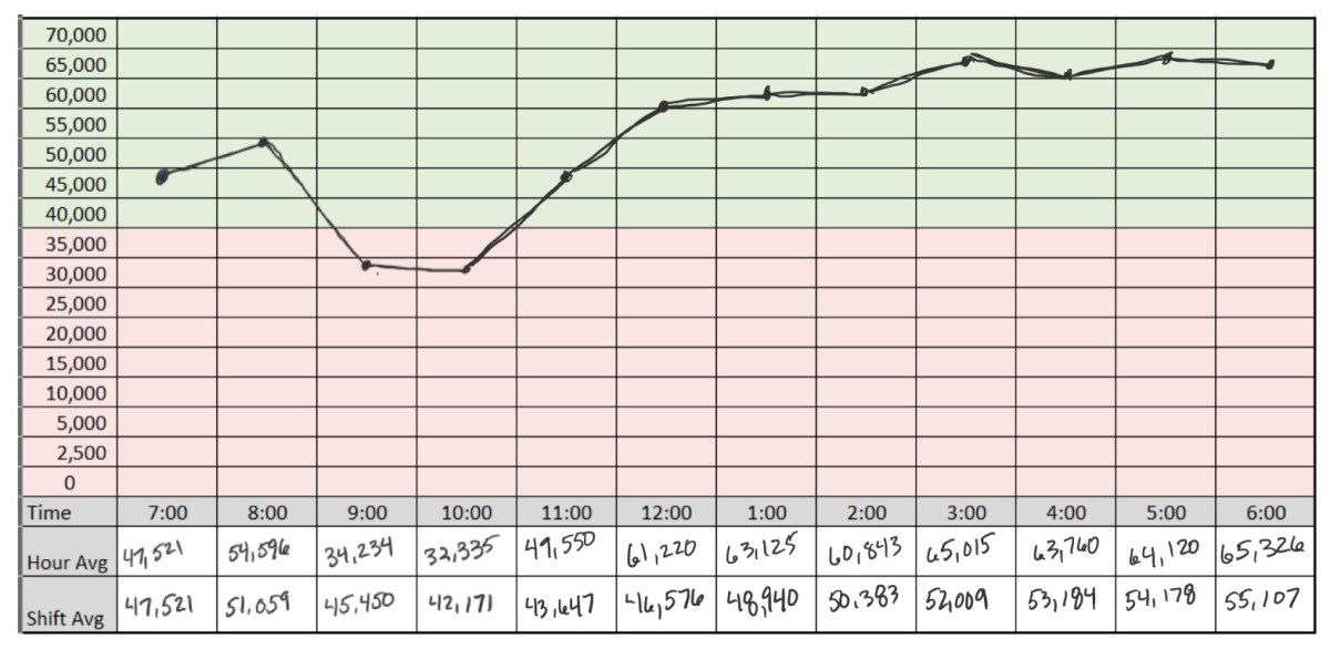
  • Invest in Data Analytics: Utilize advanced data analytics tools and techniques to analyze large datasets, identify trends, and uncover meaningful insights that can drive informed decision-making.
  • Continuous Learning: Encourage a culture of continuous learning by providing training opportunities, promoting knowledge-sharing sessions, and encouraging personal development.
  • Develop Mentoring Relationships: Establish mentorship programs where experienced leaders can guide and share their insights with emerging leaders, facilitating knowledge transfer and deepening understanding.

Conclusion

In manufacturing leadership, true understanding surpasses mere data acquisition. It drives effective decision-making and operational excellence. By recognizing the differences and prioritizing insights and root causes, leaders can enhance their understanding of daily operations. Embracing strategies such as gemba walks, collaboration, data analytics, continuous learning, and mentoring relationships empowers leaders to unlock hidden potential and drive transformative change. With a deep understanding, manufacturing leaders navigate complexities with confidence, achieving lasting success.

Daily Management System

his allowed everyone to track their performance and make improvements where necessary. We also provided regular feedback to our hourly team members and operators on their performance and how they were contributing to the overall success of the business.

Using Visual Tools to Manage Your Team, Department, or Organization

I am excited as we have rolled out our new Daily Management System and Portland Bottling Company., As a manager in the beverage industry, it’s essential to have a clear and concise visual management system in place. This system should be updated regularly with Key Performance Indicators (KPIs) to ensure that everyone on the team is on the same page. The purpose of a visual management board is to provide everyone with a comprehensive overview of the business’s performance and to promote transparency and accountability, and teamwork.

In this blog post, we will be discussing how we updated our visual management board with KPIs, and how we got our hourly team members and operators involved in the process.

Step 1: Identifying the Key Performance Indicators

The first step in updating our visual management board was to identify the KPIs that would be the most impactful for our team. We considered a range of factors, including production efficiency, product quality, and customer satisfaction, to determine which KPIs would be the most relevant. All team members got to weigh in on the discussion. The critical point is that if your hourly team members are going to “own” the board, they have to be involved in the creation process.

Step 2: Setting Up the Visual Management Board

We chose to go with a basic board but with a twist or two on it.

  1. Since we truly believe that our People are our greatest asset – that KPI comes first.
  2. Secondly, we chose Safety as that easily coincides with taking care of our team members and ensuring compliance with training requirements.

Step 3: Involving the Hourly Team Members and Operators

Once we had identified some of the KPIs, we set up a visual management board in our production office area. We held multiple training sessions with multiple departments and even enjoyed “mock” meetings where we got to do a meeting and offer feedback and support to each other. It actually turned out to be quite fun.

The next step was to get our hourly team members and operators involved in the process. We organized a team meeting and invited everyone to discuss the new visual management board. During the meeting, we explained the purpose of the board and how the KPIs would be used to improve production efficiency and customer satisfaction. We also invited everyone to suggest additional KPIs that they believed would be beneficial.

As we implemented the system live, the boards were placed as close to the machines as possible, where they could be easily seen by everyone on the team. We used color-coded charts and graphs to display the KPIs, which made it easy for everyone to understand the data.

Step 4: Updating the Visual Management Board Regularly

We updated the visual management board regularly, ensuring that the KPIs were accurate and up-to-date. This allowed everyone to track their performance and make improvements where necessary. We also provided regular feedback to our hourly team members and operators on their performance and how they were contributing to the overall success of the business.

Step 5: Celebrating Success

Finally, we celebrated success by recognizing the achievements of our hourly team members and operators. This helped to promote a positive and motivated work environment, and it encouraged everyone to continue working towards our shared goals.

Step 6: Management Gemba Walks

Don’t forget about your Management Gemba Walks.

The purpose of management Gemba walks in a visual management system is to enable managers to observe and evaluate how work is being performed in the workplace. Gemba is a Japanese term that means “the real place” or “the place where work is done.” Gemba walks are a management technique that involves going to the actual location where work is being performed, observing the process, and talking to the employees who are performing the work.

In the context of a visual management system, Gemba walks allow managers to see how the system is functioning in practice, identify any issues or problems, and make necessary improvements. Visual management systems are designed to make information about processes, performance, and quality visible and easily understandable, so Gemba walks can be used to ensure that the information being presented is accurate and up-to-date.

Our managers do their formal Gemba twice a week to observe as close to the machine as possible. By actively engaging with employees and observing the process in action, managers can gain a deeper understanding of how work is being done, identify any inefficiencies or areas for improvement, and provide feedback to the team. Gemba walks also provide an opportunity for managers to build relationships with employees, demonstrate their support for the team, and reinforce the importance of continuous improvement

In conclusion, updating our visual management board with KPIs has been a valuable process. It has helped us to promote collaboration, teamwork, and a shared understanding of our goals. By involving our hourly team members and operators in the process, we have been able to improve production efficiency, product quality, and customer satisfaction.

The Shift Playbook

“How do we know what to improve if we don’t know what’s happening?”

Six Questions that Guarantee Your Daily Win

Using SPC or Statistical Process Control charting and basic time tracking for downtime/defects

The backstory is that we were in the middle of our ramp up phase in the new plant.  Managers, supervisors, and operators alike were all learning the equipment and production processes.  We were struggling to improve performance.  In a discussion with the team the comment was made – “how do we know what to improve if we don’t know what’s happening?”  We had machine data available. We have various HMI screens that give current machine performance. But, as a whole integrated production line, we did not have visibility of how everything worked together.

That gap birthed the shift playbook.  It was designed to give the supervisors a current state performance metric by capturing the hour by hour performance, visualizing the previous hour and the shift trend, identifying targets, and tracking abnormal conditions or events that led to downtime.

There are two parts.  The first one is a standard SPC chart that displays each hour slot of a twelve hour shift.  The minimum shift average of 40,000 parts per hour is designated by a change of color from green to red…simple yet genius

SPC Chart – The First Three Questions

The SPC chart is used to answer the following three questions:

  1. How did we do?
  2. How are we doing?
  3. If nothing changes – where will we end up?

How did we do?

Depending on your operation there can be differing amounts of variation in your production process.  Analyzing this particular process it was decided that hour by hour would be the optimal measurement and would allow some variability that occurs through each sixty minute cycle to normalized over time. 

At the end of the hour, the supervisor places a dot on their playbook sheet in the closes square that represents the actual production performance number.  Plotting the following data would result in the following visual representation:

  • 06:00 – 07:00 – 47,521
  • 07:00 – 08:00 – 54,596
  • 08:00 – 09:00 – 34,234
  • 09:00 – 10:00 – 32,335

Answering the question “how did we do?” is easy when represented with a simple SPC chart.  We can see that we started off fine, things got better and then something happened that caused productivity to fall below our target minimum.

How are we doing?

We can also answer the question “how are we doing?’ by looking at the number in the shift average row.  We see that given the current hourly performance, the shift average is starting to go down.  It is easy to see that we are at risk.

If nothing changes – where will we end up?

A short while ago, I was doing a Gemba walk with the on-shift supervisor.  We reviewed the Shift Playbook for the current state.  It was a similar situation – the dots were pointing in a downward direction.  I called an all-hands meeting on the production floor with the supervisors and leads.  We looked at the playbook as a group.  When I asked the question – “If nothing changes where will we end up by the end of the shift?”  Everyone knew the answer.  If nothing changes we will either continue to decline or remain below goal for the shift.

That quick answer then led us to the next section of the playbook where we answer the second set of questions.

The Production Delay Log

The production delay log is a simple yet powerful tool when combined with the SPC chart above.  It helps answer these questions:

  1. What is getting in our way?
  2. What impact is it having?
  3. What do we need to focus on to improve?

We had decided as a team that just like tracking the hour by hour at a minimum, that there was too much noise and busyness to track every delay.  We aligned that we would only track incidents that resulted in delays greater than 10 minutes.  Your operation may be mature enough to tighten the interval for tracking but as a startup facility we found it more value added to address the larger items first. 

This would also keep us focusing on the critical items and not chasing everything.

Reviewing a sample delay log that would match the SPC chart example above we would see the following:

By keeping a general production delay log the information from different machines or areas of the production line can be brought together to see if there are any patterns. 

The data answers the last two questions.  5/6 or 83% of our delay is caused by the occurrence of twisted cases getting to machine 3.  We can also see that of the total downtime, approximately 60 minutes – 50 minutes are caused by one type of incident. 

It is easy to see the pattern here.  When the team reviewed the playbook there was agreement that we need to Gemba machine 3 and see where the problem is coming from.

That is exactly what we did.  The whole team went to machine 3 to watch the delay happen.  While we were there we saw a twisted case arrive – already twisted.  We decided to move upstream.  We went to the next machine which was a combiner.  It takes two different source conveyors and combines them into one line a moves them to a palletizing machine.

We watched for about ten to fifteen minutes and then it happened.  We saw a case get hung up on one of the side / edge rollers that merged the case to the other line.  It didn’t happen every time but as we continued to watch we noticed that upon closer inspection, every case looked like it bumped something – it caused the case to shift slightly.  The severity of it was random.  Every ten to fifteen minutes it was severe enough to cause the case to turn 90 degrees and stop machine 3 downstream. 

We called maintenance right away who made a slight adjustment to the angle.  We then stayed to validate whether our hypothesis was correct.  The “bump” was gone and no repeats of the incident occurred over the next thirty minutes.

The playbook was completed with a much improved hour by hour and upward moving average.  By the end of the shift the team finished with the fifth highest shift production record as of that date.

Summary

Using and combining the two simple yet effective tools – an SPC chart and production delay log into a Shift Playbook can provide the data and visualization to help your team know what defines winning, understand the current state, and identify roadblocks that are preventing them from winning.